Design Tips: How To Choose Colors
Hafers Home Furnishings & Design

Choosing the perfect color scheme for your home can feel a bit daunting. Our tips and tricks will demystify the process and help you create a well-balanced reflection of your personal style.
The 60-30-10 Color Rule
For the most balanced, appealing color palette, stick to the 60-30-10 rule. The three-color palette is frequently used in interior decorating (and often shows up in the beautiful interiors you see in magazines or on Pinterest).
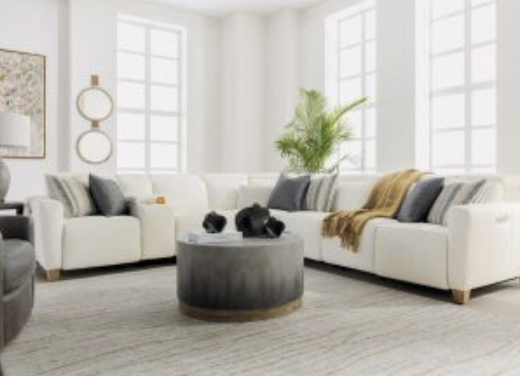
To follow the guideline, pick a dominant color to decorate the majority of the space. In a living room, the dominant color usually applies to your walls, the floor, and large-scale furniture such as your sofa or sectional.
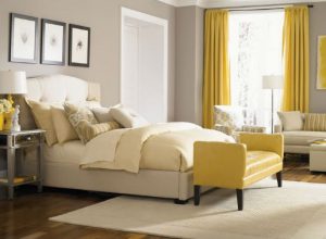
The secondary color adds contrast to the room. This color is what applies to your furniture, window treatments, accent wall, textiles, or area rugs. Any color that complements your dominant color works well as a secondary color. To keep the space interesting, select varying tones of the same color (shades of gray, for example).
Your accent color adds emphasis and points of interest to a color scheme. Accent colors can be bold and vivid (think bright yellow or deep emerald) or they can be toned down neutrals, metallics, or darker colors (such as black or espresso brown). In the living room, accent pieces are usually throw pillows, side tables, artwork, accessories, and any other touches of color.
More of a guideline than a hard and fast rule, the most effective three-color palettes are complementary. By creating color palettes in ratios, you create instant layers, depth, and a definitive mood to your space.
Great Color Schemes
Here are some examples of effective color schemes with three-color palettes:
- White as the dominant color scheme, with gray as the secondary shade and bright yellow as an accent.
- Light gray as the dominant color scheme, with white or neutral as the secondary shade and pink and metallic accents.
- Dark gray as the dominant color scheme, with white as the secondary shade and navy or natural fiber accents.
- Taupe as the dominant color scheme, with bright white as the secondary shade and burgundy accents.
How to Build Your Color Palette
If your goal is a single palette for the entire house, start with the largest room in your home (usually your living room or kitchen). Starting in the most centrally located room gives you a great foundation for your whole-house color palette.
Also note which rooms in your home are visible to one another. If your living room opens up to the kitchen or dining room, select a color scheme that flows smoothly from room to room, creating harmony. One great tip is to view any connected rooms together, not as separate spaces. Create color connections that bring elements of the rooms into each other, such as white walls and red accents.
Color Palette Mistakes to Avoid
One of the most common design mistakes is selecting your paint colors before you’ve decided on your furniture, finishes, fabrics, and surface materials. Once the walls are painted, it can be challenging to find fabric and furniture that’s a perfect match.
What to do instead: Select your furniture, fabrics, and surface materials first. With those decisions made, select a few paint swatches that complement those colors and textures. Test your top color choices in each room and next to your furnishings to decide what color palette will look best in your space.
Top Design Ideas
Creative ideas and design tips. The latest styles trending and design concepts that help you to get the most out of your home.
Top Shopping Advice
Guidance for picking the right pieces. Useful tips for how to recognize quality and how to make it last.


